
Below is a case study by Loose Connections to design a new logo for the Wilshaw Group.
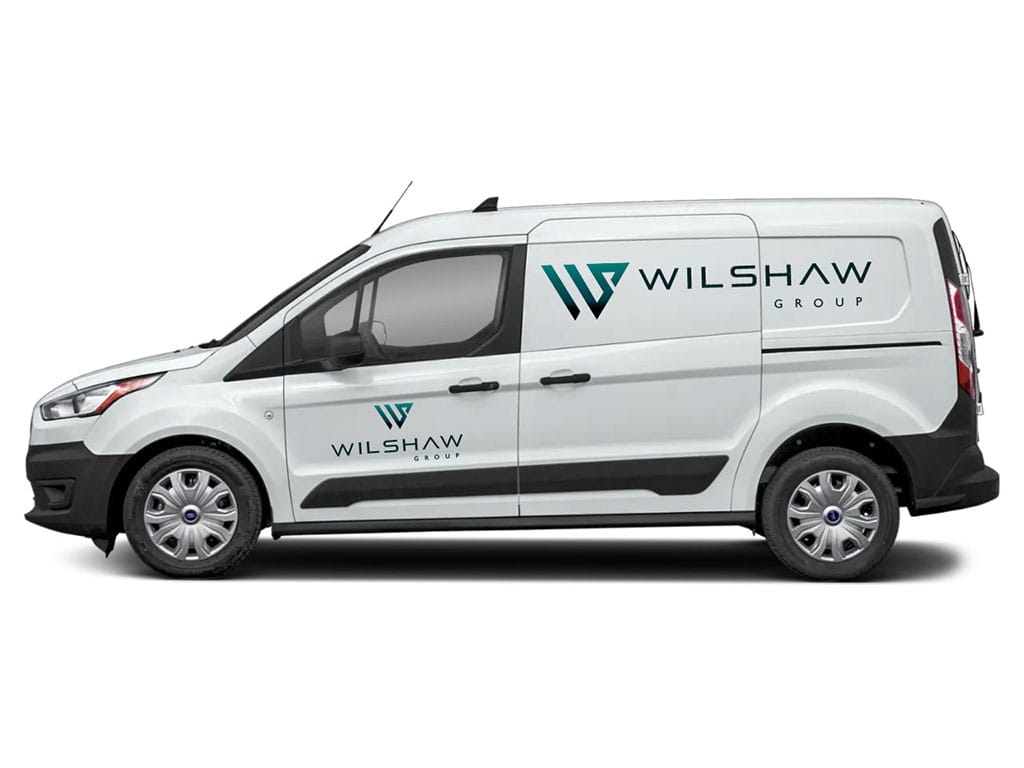
From this discussion, and by working through the questionnaire, a few key points emerged. Andy and Sean described the desired brand personality as Clean, Modern and Simple, and highlighted the importance of versatility – particularly that the logo should work effectively across a range of uses, including prominent placement on a white Custom Transit Connect Van.
They expressed a preference for a graphical motif using the letters W and S, taken from the Wilshaw name. An important consideration was that the logo should be future-proof, allowing room for the business to expand or potentially pivot into new areas. Because of this, Andy and Sean favoured a letter-based design over a more literal or narrowly defined shape or icon, ensuring the brand identity would remain relevant and adaptable in the long term.
With a clear brief established, we moved into the design phase and created 18 different motif variations of the WS concept. After internal review, we narrowed these down to the top 4 strongest options which we presented in a PDF presentation. This included visuals of how each concept would look on both light and dark backgrounds, and as a mock-up of the van livery to help Sean and Andy with the decision process.
By working closely with Andy and Sean at every step through the design process we are proud to have produced a final logo design that represents their visual identity and brand exact to their requirements. We’re excited to have helped Andy and Sean lay the groundwork for The Wilshaw Group’s visual identity and look forward to seeing their new logo out on the road soon!
Andy and Sean approached us as they were setting up a new business venture – The Wilshaw Group – and were looking to establish a strong visual identity starting with a logo and wanted to get the design right first time.
To begin the project, we arranged an in-person meeting to discuss their requirements and get a full understanding of their vision and brand direction. During this session, we worked through the Loose Connections Logo Design Client Questionnaire document with them – this document is a tool we use to help define the brief and lay the foundation for the creative process.
When a potential client enquires about a logo design, we begin by sending them our Logo Design Process Document – a step-by-step guide that outlines exactly what to expect during the project. This document helps to clearly explain each stage of the process, which are as follows:
This approach ensures transparency from the outset and allows clients to feel confident and informed throughout the project. Once the logo is finalised, we deliver a comprehensive set of logo files tailored for both print and digital use.
These include raster formats (JPEG and PNG in various colour options for screen use such as social media, email footers, and documents) and vector formats (AI and EPS for scalable uses like signage, van graphics, and business stationery). We also provide a PDF brand guideline sheet detailing the final logo, font selections, and full RGB, CMYK, and HEX colour codes to ensure consistent use of the brand moving forward.
Add your name and email below and let us know what you are looking for.

With a Linux package, you have complete control over the software installed in your hosting package. You can choose from 70+ one-click installs, including many of the top CMS’s and applications available.
With these packages, Wordpress will be auto-installed so that you can get started on your new website immediately :)
With a Windows Hosting package, you have complete control over the software installed in your hosting package. You can choose from 70+ one-click installs, including many of the top CMS’s and applications available.